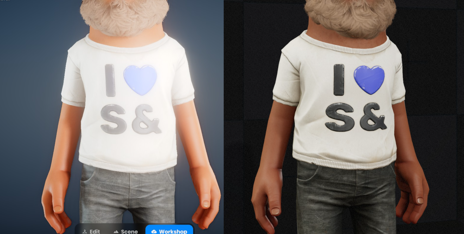
Hello! I'm working on cosmetics for Terry, and there are few things i've noticed in the fitting room:
1. Colors in Fitting room menu are significantly blown out 2. Blooming effect is very intense for white materials
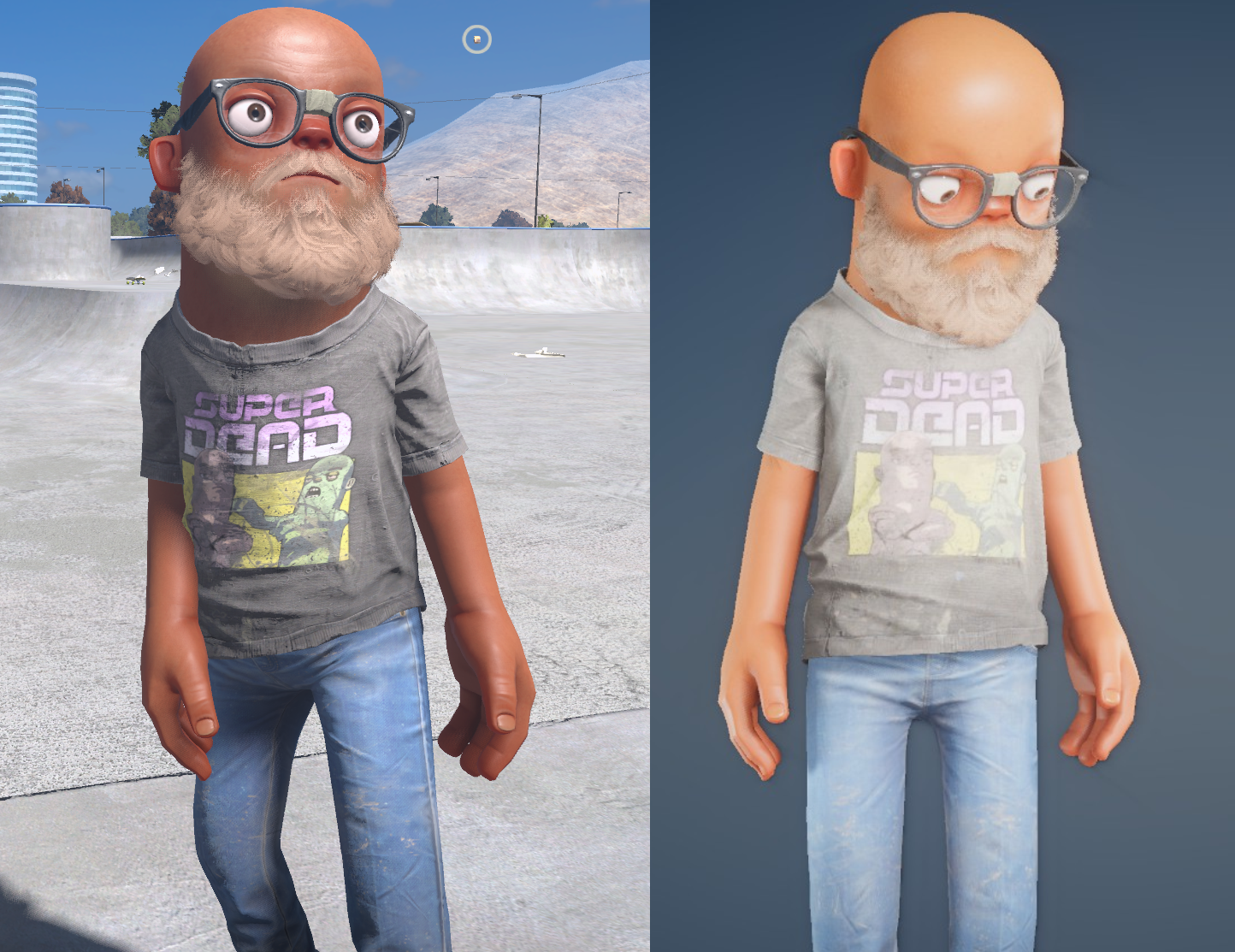
image.png2.23 MBThis is an example of how same Tshirt looks it bright daylight in the game vs Fitting room menu.
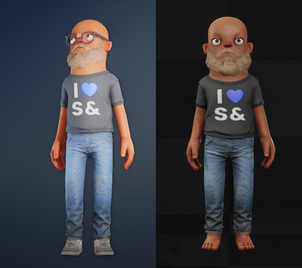
image.png871.81 KBsame item previewed in the Menu vs "Workshop skin viewer" map
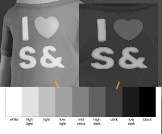
image.png99.77 KBMenu vs Albedo texture (unshaded texture). In neutral lighting (like a bright room), surfaces tend to look closer to their albedo in lit areas, while shadows appear darker. image.png56.12 KBIn the Menu colors seem to be 3 tones higher then Albedo map - which indicated very intense lighting.
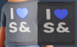
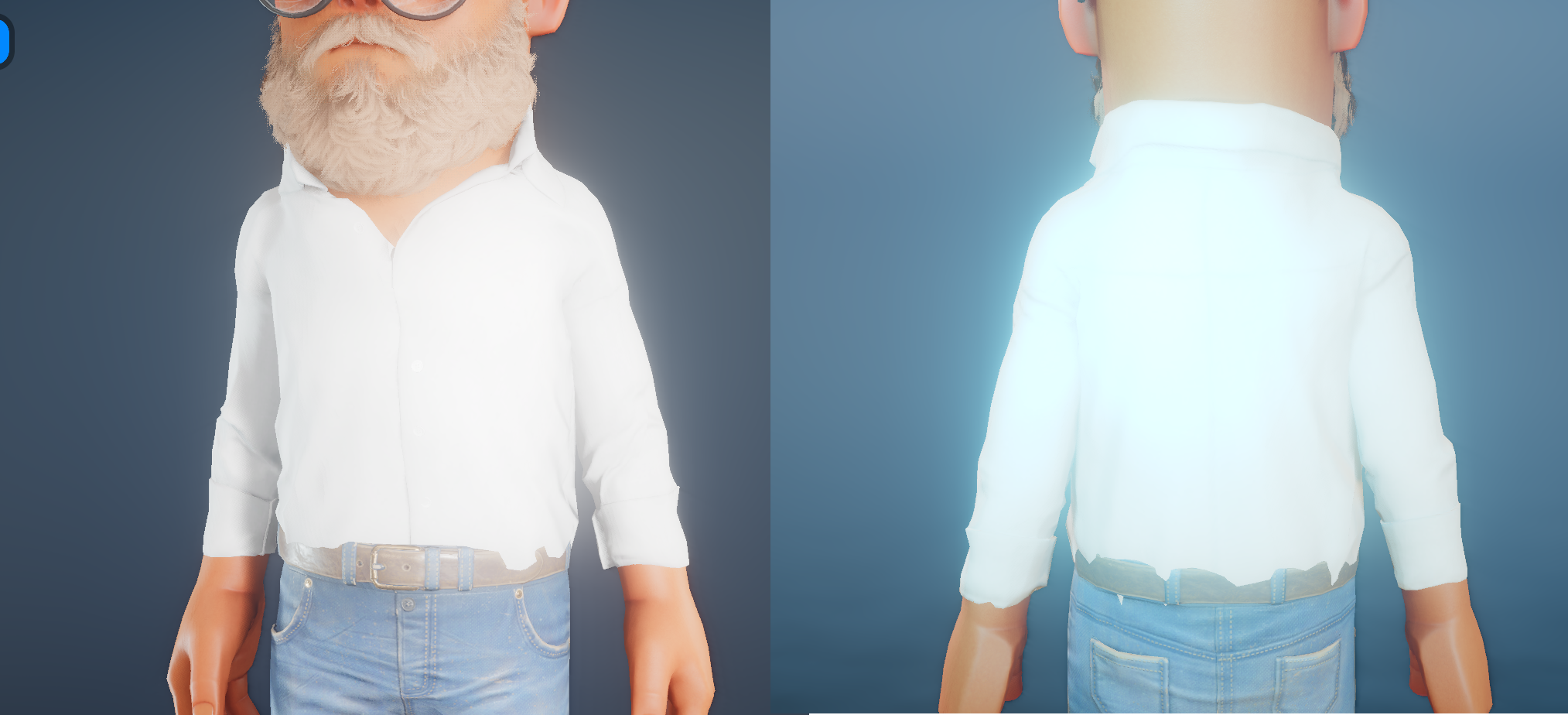
2. Seem like a Blooming post-effect is active in Menu, that turns white materials in one big glowing spot. image.png2.31 MBMenu vs "Workshop skin viewer" map
The combination of this factors makes barely possible to create white clothing, that shows proper surface details. It also makes it harder to accurately judge materials when working in texturing software or previewing them in the engine. It also might misrepresent of how cosmetic items will appear on most of the game maps.
3. A bit different topic - But we really need an ability to preview our wip-cosmetics in game menu without uploading them on server every time.
Thank you for your attention! This post aims to highlight (pun intended) an issue, rather then criticize anything.